
The Slow Death of Colors: Why the Modern World Is Losing Its Color
There was a time when the world seemed to be painted in every color imaginable. Cars came in bright orange, turquoise, yellow, and deep green. Restaurants stood out with bold red roofs and golden signs. Streets were filled with personality, buildings had character, and even an ordinary parking lot could look like a scene from a movie.
Today, something feels different.
Look around at modern cities, shopping centers, restaurants, office buildings, and residential neighborhoods. Much of the world seems to have settled into a familiar palette of gray, white, black, silver, and beige.
Cars that once came in playful shades of orange, blue, green, and yellow are now commonly seen in white, black, gray, and silver. Buildings are increasingly designed with neutral facades. Restaurants favor minimalist interiors, while commercial signs often follow carefully controlled branding guidelines.
The world has not literally lost its colors. Trees are still green, sunsets remain spectacular, and flowers continue to bloom in extraordinary shades. But in many of the everyday environments people have created, bright colors appear to be disappearing.
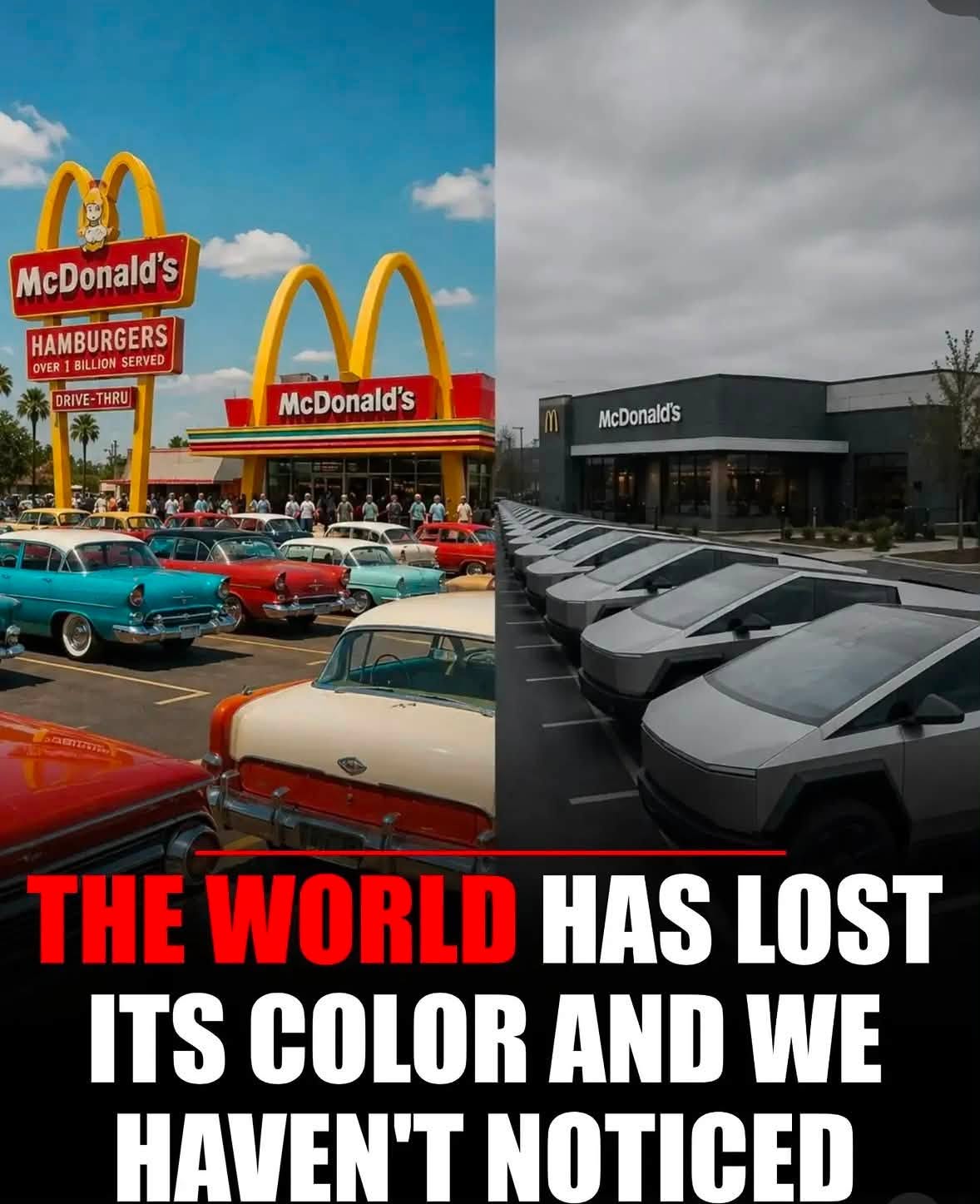
The photograph above captures this contrast beautifully. On the left, a traditional McDonald’s building with a red roof and yellow details stands beside a modern restaurant with a dark gray exterior and a much more restrained appearance. In the parking lot, colorful vintage cars occupy one side, while modern vehicles in black, white, silver, and gray fill the other.
Whether or not this exact scene represents a real historical location, the image illustrates a recognizable cultural shift.
It raises an interesting question: Why did the world once seem so colorful, and why does so much of modern life appear increasingly gray?
The answer is more complicated than changing fashion. It involves economics, manufacturing, psychology, architecture, advertising, technology, and the way modern society defines good taste.
1. When Cars Were More Than Just Transportation
For much of the twentieth century, buying a car was about more than getting from one place to another. Cars were symbols of freedom, personality, social status, and individuality.
Automakers competed to make their vehicles visually distinctive. Bright paint colors helped new models stand out in showrooms, advertisements, and crowded streets.
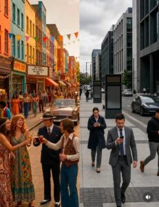
During the 1950s and 1960s, many American cars featured striking combinations of turquoise, coral, mint green, pale yellow, red, and orange. Some vehicles had contrasting roofs, decorative chrome, dramatic tailfins, and interiors that matched or complemented their exterior paint.
A car was not simply a machine. It was a statement.
Someone driving a bright orange coupe or a turquoise sedan was making a different visual impression from someone driving a black vehicle. The color itself became part of the car’s identity.
These colors also reflected the optimism and consumer culture of the postwar era. As household incomes rose in many countries, families increasingly purchased cars, appliances, and other products that represented comfort and modern living.
Manufacturers understood that color could make ordinary objects exciting.
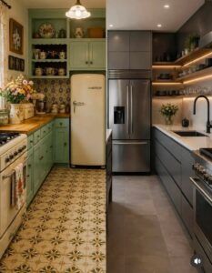
A refrigerator could be pink. A telephone could be red. A kitchen could feature mint-green cabinets. Clothing, furniture, toys, and automobiles offered a broader range of visual expression than the neutral aesthetic that dominates many modern products.
Of course, colorful cars were not universal, and many older vehicles were also black, white, or gray. Color availability depended on the manufacturer, country, price, and decade.
Nevertheless, the bright automobiles shown in the photograph evoke a period when colorful consumer products were especially visible in popular culture.
The important difference is not that everyone once preferred bright colors. It is that colorful choices were a more prominent part of the visual landscape in certain places and periods.
2. Why Modern Cars Are Mostly Black, White, Gray, and Silver
One of the clearest examples of this change can be seen on today’s roads.
Stand in a busy parking lot and count the vehicles. In many markets, black, white, gray, and silver dominate the scene. Bright blue, yellow, green, orange, and red vehicles are available, but they often make up a smaller share of the total.
Why did this happen?
There is no single explanation. Several practical and commercial factors have encouraged the popularity of neutral car colors.
Resale value matters
Many people buy cars with their future resale value in mind. A vehicle is a major purchase, and buyers often want to avoid choices they believe could make it harder to sell later.
Neutral colors are widely perceived as safe choices. Black, white, gray, and silver appeal to a broad range of buyers, making them attractive options for people who want their vehicles to remain marketable.
A bright yellow or unusual green car can be appealing to the right person, but it may narrow the pool of potential buyers in some markets.
When millions of customers make purchasing decisions with resale value in mind, those preferences influence the entire market.
Companies prefer consistency
Fleet operators, rental companies, corporate businesses, and delivery services often purchase vehicles in standard colors.
White is particularly common in commercial fleets because it provides a neutral appearance and can be convenient for applying company logos or advertising graphics.
Black, silver, and gray also offer a professional appearance that many businesses consider appropriate.
As fleet purchases contribute to the number of vehicles on the road, their preferences can influence what people see in everyday traffic.
Neutral colors suit many designs
Modern vehicles often feature complex body shapes, sculpted panels, sharp headlights, and large areas of glossy trim.
Manufacturers may choose neutral colors because they complement these design features without competing with them.
Gray can emphasize the contours of a vehicle. Black can create a dramatic appearance. White can highlight clean lines and contrast with dark windows or trim.
These choices are partly aesthetic, not merely financial.
Color trends follow consumer demand
Automakers do not choose paint colors in isolation. They study customer preferences, regional markets, manufacturing costs, and trends in competing products.
If customers repeatedly select neutral colors, manufacturers have an incentive to offer more of them.
If fewer people order unusual colors, companies may reduce the number of available options.
This creates a cycle: customers see fewer colorful vehicles, become accustomed to neutral colors, and increasingly regard them as normal.
Eventually, what began as a preference becomes the default.
The result is a parking lot where dozens of vehicles can appear remarkably similar even when they come from different manufacturers.
And that is precisely what makes the colorful vintage cars in the photograph so striking.
They do not simply look old. They look different from the visual world that surrounds them.
3. The Rise of the Gray Building
The same transformation has taken place in architecture.
Older commercial buildings often used color to attract attention. Restaurants had distinctive roofs, colorful signs, decorative facades, and architectural features designed to be recognized from a distance.
A roadside diner might feature a bright red exterior. A small-town cinema might display a colorful marquee. A neighborhood bakery might use painted lettering and a distinctive entrance.
These places were designed to be noticed.
Modern commercial architecture often follows a different philosophy.
Many new buildings use gray concrete, dark metal panels, glass, white walls, and simple geometric forms. The aim is frequently to create an appearance that feels clean, sophisticated, contemporary, and timeless.
Minimalism has become influential in architecture, interior design, retail, and branding.
Instead of relying on bright colors and decorative details, designers may emphasize proportions, materials, lighting, and space.
This approach can produce beautiful buildings. A carefully designed gray structure can be elegant, and neutral colors can help a building fit into its surroundings.
The problem arises when the same visual language is repeated everywhere.
When shopping centers, restaurants, apartment blocks, offices, and hotels all adopt similar palettes, entire neighborhoods can begin to look interchangeable.
A building may be modern, expensive, and professionally designed while still contributing little visual variety to the street.
In the past, a visitor might remember a town because of its colorful storefronts or distinctive buildings. Today, that same visitor might struggle to distinguish one commercial district from another.
The issue is not that modern architecture is inherently worse than older architecture.
It is that when visual consistency becomes more important than local character, places can lose some of the individuality that makes them memorable.
Why gray became associated with sophistication
Gray has several qualities that make it attractive to designers.
It is versatile, works with many materials, and can create a restrained atmosphere. It also avoids the strong emotional associations that certain bright colors may produce.
For businesses seeking a premium image, gray can communicate seriousness and simplicity.
Black may suggest luxury. White may suggest cleanliness. Beige may suggest warmth and natural materials.
These associations are not universal, but they influence how designers and consumers perceive buildings and products.
Over time, neutral palettes have become closely associated with contemporary taste.
Bright colors, by comparison, may sometimes be viewed as childish, outdated, excessive, or difficult to coordinate.
That does not mean they are any of those things. It simply demonstrates how cultural expectations can shape what society considers attractive.
A colorful building can be just as sophisticated as a gray one. The difference is that modern design often rewards restraint.
When that restraint becomes the dominant approach, the world can begin to feel visually quieter.
